Leveling Up PR Week Awards
Retro inspiration meets modern motion. A bold visual identity built to celebrate the evolution of the PR industry.
Announce. Attract.
Set the Tone.
Before the show hit the stage, we launched a bold promotional campaign rooted in retro gaming nostalgia. Pixel textures, arcade-inspired typography, and punchy transitions helped us tease the year’s identity in a playful, eye-catching way.
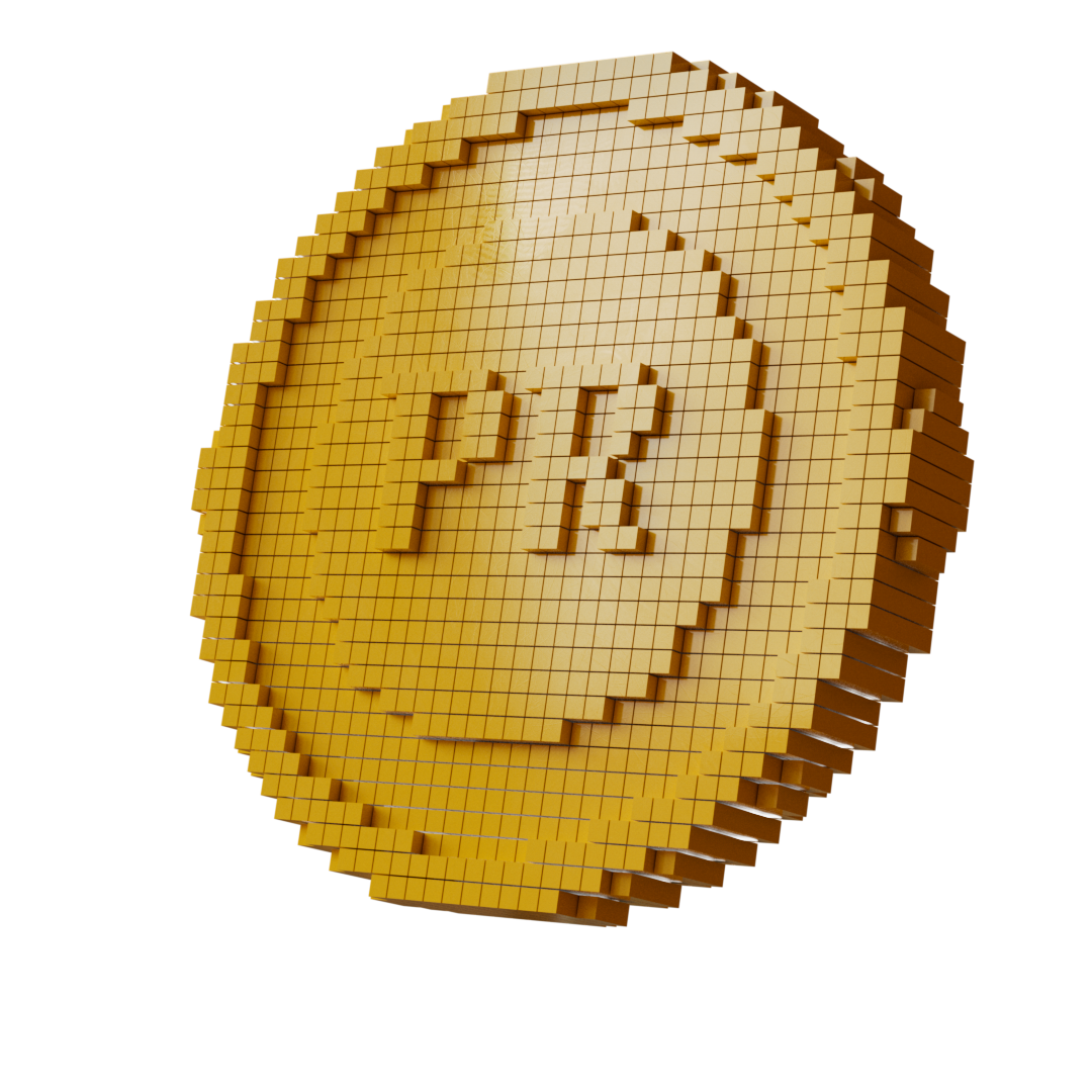
Developing the Theme
We anchored the concept in retro visuals - 8-bit colours, scanlines, UI cues - and then evolved it to reflect the current creative landscape. The result: a visual language that honoured the past while celebrating progress in the PR industry.
Reimagining Retro for the Main Event
For the show itself, we modernised the aesthetic — pushing the retro inspiration into sleek, contemporary motion. Background loops brought the stage to life, while a custom entrance sequence and walk-in animation helped set the mood from doors open to show start.


Creative Direction
Design
Development
Motion
Work completed during my role at First Image
Agency: First Image | Client: Haymarket UK